Saturday, June 25, 2011

Ad Wear Inc - American Flyer

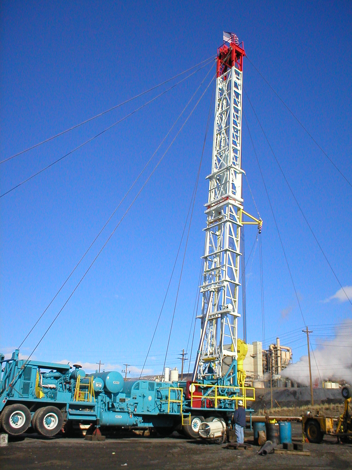
This weekend Ad Wear is attending a convention and has a booth to sell their goods. And they wanted me to create a flyer that they would handout at the event. Once again not a lot of direction just that it needs these words "Your American made and Union Promotional Products and Apparel Supplier"

Other than that I pulled this together. With July 4th coming up and it saying American Made it had have an American Flag. So I pulled the pictures together got there information and made the flyer. I am really pleased with the logo for American Made. The fonts and layout over the flag is just perfect!

Ad Wear Inc Winter Promotion 1


Ad Wear before Christmas sends out special offers to there clients with offers and they asked me to design the seasonal brochure this year. It wont go out till November, but they thought it would take me longer to come up with ideas. So I submitted 3 ideas with one variation.

They gave me no real direction other than it for the winter holidays and that it will be printed on 11x17 paper from a Xerox machine and folded like a book. So each page would be the standard 8.5x11 page. All I need to do now was come up with a theme and and show it on the cover page and leave a spot for a photograph to be placed of a product available.

Since this was not going to be professional printed I knew I had some limitations that there could be no bleeds (meaning the design could not blend off the page. The normal printing process does not allow to print outside margins, it leave a white boarder, so I let my designs reflect this.

First, I went with nature photographs of the outdoors for the background, and a very monochromatic color scheme. Second, wanted a more modern approach so I choose a snowflake design with a vivid red hue to use ad its accent color. Third, was a simple blue snowflake inspired design with a variation.

I know what I would choose, the company has yet to choose, so we will see what they go with.

Ad Wear Inc - Volleyball


Well design is for outdoor volleyball. This was total designers freedom. So I gave them two versions to choose from. What do you think they choose?


The bottom the Volleyball sun

Ad Wear Inc Barrick


Another client of Ad Wear is Barrick and they wanted one of there Drilling Rigs to be made into a Large Embroidery for the back of a jacket. So from the photos provided I created the design above.

The tower is much taller, but there is limited space on shirt, when you want the rig to take center stage, so some liberties were made with the crown on the tower. In a project like this you have to choose what to blend and what to detail out, the job is to big to make it so detailed, other wise the thread would never hold up on the jacked. Originally I sent the design with no tie downs but then they cam back wanting them and then reduced to what the final job is at the top.

Personally I am really satisfied with the job, and love the way it turned out. The color choice was also good. I wish I had a picture of the finished job, it looks awesome.

Ad Wear Inc T-Shirt


So I now work for Ad Wear Inc Located in Salt Lake City Utah. The do shirts and promotional items for corporations. One of their big clients is Salt Lake County and with summer sports programs here are a few T-Shirt Designs I have done in my 2 weeks of employment.

All designs are done with Adobe Illustrator, I prefer that program so you can resize and shape without loosing the integrity of the design.

Friday, May 20, 2011

CandyBox

For my portfolio class I needed to create a box, so I decided to make this CandyBox. I made this all in Adobe Illustrator.

Completed in March of 2011.

Wednesday, April 20, 2011

My Desktop

Well I wanted a desktop image for my Mac that was me. So here is one that I created. I love the texture of the background. My favorite part is the the new arrangement of my name and title with my monogram.

Completed in April of 2011.

Thursday, April 7, 2011

Facebreaker Ads


For my video class, I had to create an ad for an EA game (Facebreaker) using some green screen interviews. They clips had to be the focus of the ad. I had to create two ads, one 60 seconds and the other 30 seconds. I also had to do the video 100% in Adobe Premiere.

I like the way they turned out, I want to get CS5 so I can clean the green screen better. But overall its excellent. The video just aligned perfectly.

Completed in April of 2011

Tuesday, April 5, 2011

Flash Website - Portfolio

In my second Adobe Flash Class, I had to design another website. It was to be for me as my website. So I have another website for me in Flash, I like this one a lot better. I wanted it to match my Letterhead and echo the theme but be more dramatic and streamline. This is a screen shot, of the homepage. I am looking to get it loaded onto the web, so it will be a functioning site and replace this website.

Completed in March of 2011.

Thursday, March 24, 2011

KFC Campaign 3


Here is the rest of the KFC Assignment. The first is the Flash Landing Page for the project. All I had to create was a website to play a video on, I decided to have the video on a Flash Website, so it was more dynamic, and could have a intro video to the website.

The bottom two are Flash Banners to promote the event, and the program. Each one as movement and then repeats. Sadly you cannot see the movement, since Blogger does not support Flash. But personally I love them!

Completed in February of 2011.

FXD Video - Portfolio Redemption


While working for Full Service Web Design I had the chance to design a video for a company called FX Diversified: Wealth Management. I used Adobe After Effects, and Final Cut Pro to complete the project. The video's script was created by the owner of the company, I had to create the video to intrigue and invite the viewer the listen and learn more about the company. The video is for a financial institution.

Completed in March of 2011.

Since then I have completed 10 more videos for the company to use on their website. I have also helped design and create the logo in use for the video, website, and the company.

Aspire Logo


Currently I work for Full Service Web Design as an Intern Designer. Above is a logo I designed for one of their clients. Can you guess which one they liked? The company was not sure exactly what they wanted other than a dancing figure. The company looked through the offers and settled on the design on top with the curvy letter "A." Not my favorite, I personally like the last one.

Completed in January of 2011.

Wednesday, February 16, 2011

Face


This assignment was to take a picture and then take 3 different views and due hatching, stippling, and cross hatching in one of the images. So I choose a face and did the three techniques.

Completed in January of 2011

KFC Campaign 2


This assignment was to complete an ad campaign for KFC's Colonel's Corner at the Rio Tinto Stadium. For the campaign I wanted to do something different so I came up with my Colonel Sanders character. And then the rest of the campaign fell into place.

This is one of the Jumbotron ads for the Stadium

Completed in February of 2011

KFC Campaign 1


This assignment was to complete an ad campaign for KFC's Colonel's Corner at the Rio Tinto Stadium. For the campaign I wanted to do something different so I came up with my Colonel Sanders character. And then the rest of the campaign fell into place.

Completed in February of 2011

Thursday, November 18, 2010

Concert Package


This assignment was to be done all in Photoshop. It was also to have a poster, CD Cover, Program Cover, and Ticket for a Jazz Event. I choose DixieLand Jazz that originated in New Orleans. That is were my father and his family is from, so I love the area and people of Louisiana.

The Design evolved into what you see, the Poster was first and then everything else based on that design. I kept int unified and cohesive with each piece of the package. The background image is a saxophone with a textures and images overlaid to create the final product.

Completed in November of 2010

Wednesday, November 17, 2010

Skateboard

This was my final project for my Production Development Class. We had the chance to design a skateboard. Everything was open; it could go in any direction, it was to just be what I wanted. I really struggled with the design. I first did some trendy designs, and more grungy/punk things; but none ever looked good to me.

So I decided to go minimal and keep the design clean and then echo a popular design in tattoos. People love chinese characters so I based my design off of the symbol for peace, and went from there. I really like the end product, it only took me 10 minutes. It amazes me how sometimes a good design can take so little time.

Completed in November of 2010.

Thursday, November 11, 2010

Watkins Poster

This poster assignment was to announce and guest lecture. We had to choose the designer and duplicate their style in the poster. So my choice was Craig Watkins of Tin Star Media. You can see his website at: http://tinstarmedia.com/ or click here: Tin Star Media.

This was completed in November of 2010

Tuesday, October 26, 2010

Monogram

I wanted to create a letterhead for my self, the start of that was my Monogram. I like the clean lines and simplicity of the colors and design. Also I like deep rich colors, that play off each other; the way the Golds make the Blue stand out. Since it is an angular design, the letter is curvy and has a romantic feel to balance the design.

Completed in October or 2010.

Thursday, October 21, 2010

StompBox Letterhead


This assignment was a lot of fun. This was for one of my design classes. The task was to design a logo, letterhead including envelope, business card for the company and a Door hanger for advertisement.

The company name was to be Stompbox (a made up company) that is a snowboarding and apparel retailer. I chose to make my business card and door hanger double sided. The business card has the logo on one side, and the personal information on the other side. The Hanger is double sided, so that on one side the graphic image could be used to capture the interest of the recipient while the other side has the company information on it. The Logo on the printed material has been dulled a bit so that it will be cheaper to print. Only the hanger has the full color logo.

The door hanger doesn't have writing or graphics in the top 2 inches for a reason. This is to accommodate where the door knob cut out will go.

Completed in October of 2010.