Friday, May 20, 2011

CandyBox

For my portfolio class I needed to create a box, so I decided to make this CandyBox. I made this all in Adobe Illustrator.

Completed in March of 2011.

Wednesday, April 20, 2011

My Desktop

Well I wanted a desktop image for my Mac that was me. So here is one that I created. I love the texture of the background. My favorite part is the the new arrangement of my name and title with my monogram.

Completed in April of 2011.

Thursday, April 7, 2011

Facebreaker Ads


For my video class, I had to create an ad for an EA game (Facebreaker) using some green screen interviews. They clips had to be the focus of the ad. I had to create two ads, one 60 seconds and the other 30 seconds. I also had to do the video 100% in Adobe Premiere.

I like the way they turned out, I want to get CS5 so I can clean the green screen better. But overall its excellent. The video just aligned perfectly.

Completed in April of 2011

Tuesday, April 5, 2011

Flash Website - Portfolio

In my second Adobe Flash Class, I had to design another website. It was to be for me as my website. So I have another website for me in Flash, I like this one a lot better. I wanted it to match my Letterhead and echo the theme but be more dramatic and streamline. This is a screen shot, of the homepage. I am looking to get it loaded onto the web, so it will be a functioning site and replace this website.

Completed in March of 2011.
Thursday, March 24, 2011

KFC Campaign 3


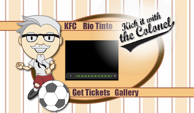
Here is the rest of the KFC Assignment. The first is the Flash Landing Page for the project. All I had to create was a website to play a video on, I decided to have the video on a Flash Website, so it was more dynamic, and could have a intro video to the website.

The bottom two are Flash Banners to promote the event, and the program. Each one as movement and then repeats. Sadly you cannot see the movement, since Blogger does not support Flash. But personally I love them!

Completed in February of 2011.

FXD Video - Portfolio Redemption


While working for Full Service Web Design I had the chance to design a video for a company called FX Diversified: Wealth Management. I used Adobe After Effects, and Final Cut Pro to complete the project. The video's script was created by the owner of the company, I had to create the video to intrigue and invite the viewer the listen and learn more about the company. The video is for a financial institution.

Completed in March of 2011.
Since then I have completed 10 more videos for the company to use on their website. I have also helped design and create the logo in use for the video, website, and the company.

Aspire Logo


Currently I work for Full Service Web Design as an Intern Designer. Above is a logo I designed for one of their clients. Can you guess which one they liked? The company was not sure exactly what they wanted other than a dancing figure. The company looked through the offers and settled on the design on top with the curvy letter "A." Not my favorite, I personally like the last one.

Completed in January of 2011.

Wednesday, February 16, 2011

Face


This assignment was to take a picture and then take 3 different views and due hatching, stippling, and cross hatching in one of the images. So I choose a face and did the three techniques.

Completed in January of 2011

KFC Campaign 2


This assignment was to complete an ad campaign for KFC's Colonel's Corner at the Rio Tinto Stadium. For the campaign I wanted to do something different so I came up with my Colonel Sanders character. And then the rest of the campaign fell into place.

This is one of the Jumbotron ads for the Stadium

Completed in February of 2011

KFC Campaign 1


This assignment was to complete an ad campaign for KFC's Colonel's Corner at the Rio Tinto Stadium. For the campaign I wanted to do something different so I came up with my Colonel Sanders character. And then the rest of the campaign fell into place.

Completed in February of 2011

Thursday, November 18, 2010

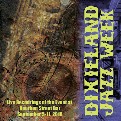
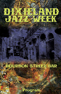
Concert Package


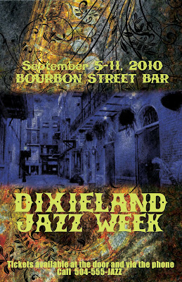
This assignment was to be done all in Photoshop. It was also to have a poster, CD Cover, Program Cover, and Ticket for a Jazz Event. I choose DixieLand Jazz that originated in New Orleans. That is were my father and his family is from, so I love the area and people of Louisiana.

The Design evolved into what you see, the Poster was first and then everything else based on that design. I kept int unified and cohesive with each piece of the package. The background image is a saxophone with a textures and images overlaid to create the final product.

Completed in November of 2010

Wednesday, November 17, 2010

Skateboard

This was my final project for my Production Development Class. We had the chance to design a skateboard. Everything was open; it could go in any direction, it was to just be what I wanted. I really struggled with the design. I first did some trendy designs, and more grungy/punk things; but none ever looked good to me.

So I decided to go minimal and keep the design clean and then echo a popular design in tattoos. People love chinese characters so I based my design off of the symbol for peace, and went from there. I really like the end product, it only took me 10 minutes. It amazes me how sometimes a good design can take so little time.

Completed in November of 2010.

Thursday, November 11, 2010

Watkins Poster

This poster assignment was to announce and guest lecture. We had to choose the designer and duplicate their style in the poster. So my choice was Craig Watkins of Tin Star Media. You can see his website at: http://tinstarmedia.com/ or click here: Tin Star Media.

This was completed in November of 2010

Tuesday, October 26, 2010

Monogram

I wanted to create a letterhead for my self, the start of that was my Monogram. I like the clean lines and simplicity of the colors and design. Also I like deep rich colors, that play off each other; the way the Golds make the Blue stand out. Since it is an angular design, the letter is curvy and has a romantic feel to balance the design.

Completed in October or 2010.

Thursday, October 21, 2010

StompBox Letterhead


This assignment was a lot of fun. This was for one of my design classes. The task was to design a logo, letterhead including envelope, business card for the company and a Door hanger for advertisement.

The company name was to be Stompbox (a made up company) that is a snowboarding and apparel retailer. I chose to make my business card and door hanger double sided. The business card has the logo on one side, and the personal information on the other side. The Hanger is double sided, so that on one side the graphic image could be used to capture the interest of the recipient while the other side has the company information on it. The Logo on the printed material has been dulled a bit so that it will be cheaper to print. Only the hanger has the full color logo.

The door hanger doesn't have writing or graphics in the top 2 inches for a reason. This is to accommodate where the door knob cut out will go.

Completed in October of 2010.

Article Stage 1

This assignment was to be done in Photoshop and had to be for an article we found online. The picture was to portray the article, and convey the message on a single page. The Article itself would be on the next page.

The article is a sorta Dear Abby thing, so its not your typical article. Even though it was not apart of the assignment I will complete it in InDesign and post the finished article and illustration later.

Completed in October of 2010.

Wednesday, October 6, 2010

T-Shirt


This was neat project to do. It had to be able to be Silk-screened on to a shirt. So the colors had to be limited, only about 2-5 colors. We had to base our design one a word we were given; mine was Astronaut.

I love doing logos, I wanted to create one and incorporate it in my design. Making Astronaut not just a word, but more like a company name. Then the rest of the design was focused around that.

Completed in October of 2010.

Wednesday, September 29, 2010

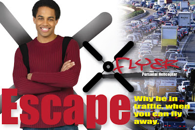
XFlyer Campaign Ad


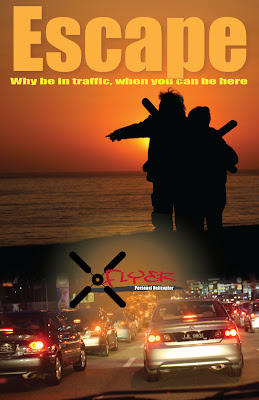
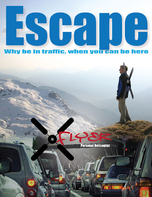
This was a fun assignment we had to come up with three items for an ad campaign. An 11x17 Poster Ad, a Magazine Ad, and a Postcard Ad. We also had to take a current product and give it a new use. My product was a ceiling fan, and using it as a personal helicopter.

The Poster would be in a store or around sporting good stores, the magazine ad would also be found in a Sports or Outdoor Magazine.

I love the Poster and Magazine Ad the most, and I am pleased with the way they turned out. Now onto my next assignment.

Completed in September of 2010.

Monday, September 20, 2010

Xflyer Logo

This is a logo for an upcoming project that I am working on. Its part of a great whole that will be coming together.

I like the look of the logo and the way it stands out.

Completed in September of 2010.

Flash Website

The final project for the Semester was a Flash Website. We had to do it as our portfolio.

To see the full website, click here: Website

This was completed in June of 2010

Pong Gone Wrong

This was a fun assignment, we had to create a flash video revamping a classic video came into a story.

I decided to mix 3 games together to create my story. The ever classic Pong and Asteroid, the third, you will have to see the video.

To see the video, click here: Pong Gone Wrong

This was completed in June of 2010.

Helicopter

One of the first things we had to do is animate a helicopter, that means both blades and make the helicopter follow a track. The Helicopter and pieces were provided, everything else made by me.

Here is what I came up with. The above is a screen shot, if you want to see the full file click here: Helicopter

Completed in May of 2010.

Sunday, September 19, 2010

Book Cover 2

This is my favorite piece in my portfolio to date. We had to create a book cover using photoshop. The title, story, author, and publisher are all fictional.

We had to create the front, back, and spine of the book cover. I researched other covers and was inspired but an Agatha Christie cover. From that I was able to come up with this design for the book cover.

Completed in June of 2010.

Tirose

Combining 2 animals together in a picture sounds quite simple; but to make it look real is another story. I choose to combine a horse and tiger together. There are still some areas that I want to improve on, but overall I really am happy with the outcome.

Completed in June of 2010.

Perfume Add

The assignment was to create an ad for a product that used photoshop only. It had to combine 4 images together. I decided to do a perfume ad, since they are more dramatic. A lot of color alteration went into each photo to then blent and have a cohesive lilac color.

Completed in May of 2010.

Flur De Duck

Flur de Duck is an assignment given to show the use of the filters and backgrounds available in Photoshop. We were given the duck image and had one night o make a square image.

Completed in June of 2010

EGC Brochure 3


During my InDesign Class, the school requested new brochures. We designed 3 brochures, this is for the medical assistant program at the College.

I worked with the Department head, to get the information they desired to have on the brochure. There were no suitable photographs that the school had, so these are from Getty Images.

Each Brochure as a unique look, but at the same time they have the same theme.

The brochure is currently being reviewed by the board to see if they are going to use them.

Completed in June of 2010.

EGC Brochure 2


During my InDesign Class, the school requested new brochures. We designed 3 brochures, this is for the criminal justice program at the College.

I worked with the Department head, to get the information they desired to have on the brochure. There were no suitable photographs that the school had, so these are from Getty Images.

Each Brochure as a unique look, but at the same time they have the same theme.

The brochure is currently being reviewed by the board to see if they are going to use them.

Completed in June of 2010.

EGC Brochure 1


During my InDesign Class, the school requested new brochures. We designed 3 brochures, this is for the dental program at the College.

I worked with the Department head, to get the information they desired to have on the brochure. There were no suitable photographs that the school had, so these are from Getty Images.

Each Brochure as a unique look, but at the same time they have the same theme.

The brochure is currently being reviewed by the board to see if they are going to use them.

Completed in June of 2010.